Technical approach
Developer friendly and developeable interface solutions.
Technical front-end understanding and clearly defined UI Design practices are a great start. Using industry standard grid systems, spacing multipliers, and asset-specific atomic design concepts takes us even further. Making cross-team cooperation seamless through established design methodologies and systems is what elevates our entire approach to the next level.
Design logic
Cross-team cooperation through common ground rules and design principles.
Clearly establishing our common language so that any participating and integrated design or development professional can easily comprehend each other's output simplifies everything from initial layout design to design documentation and end-product quality assurance. In short, you can always count on me to deliver my final, production-ready design assets in a logical and well specified, developable form.
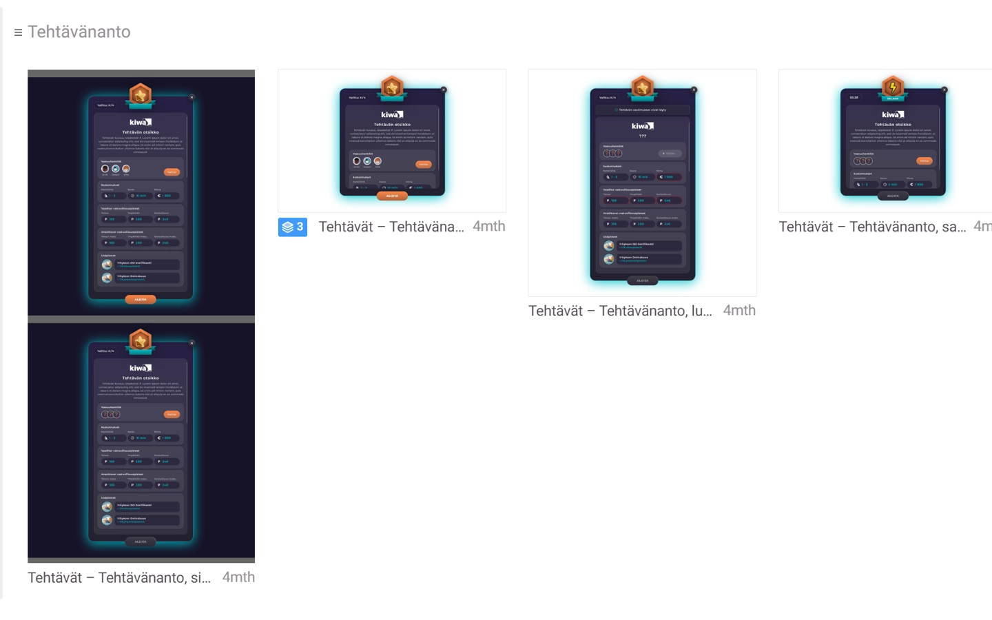
Clearly defined component state variations and relations with other service features.
Acknowledged design methods and systems.
While creating modular digital services with an array of content management options, there are numerous instance-specific content relations to consider. It is critical that we collaborate on a shared methodology that allows us to approach these situational needs in a clear and consistent manner. Clearly outlining cross-team procedures allows us to create established rules for our layout designs and technical implementation to follow. For example, we must explain how various components interact and how atomic parts fit together in any and all conceivable order. Defining these internal standards enables me to approach my design in a consistent manner, making the necessary cross-team discussion simple to follow and the created end products easy to debug.
Responsivity
Preparing for different screen resolutions and content variations.
During the UX/UI Design phase I focus on layout solutions with differing end user devices. See UX/UI Design for more. Responsivity however has to be taken into account in deeper means than just pure layout and interface decisions.
Preparing my design assets to scale at any given resolution and preparing for the effects of varying content quantities and formats is an art form in and of itself. It is not feasible to cover all possible screen variations or content options in our design documents themself. As such, it is on us to design and to implement our layouts in a way that can be easily scaled to fit these given specifications during the actual development.
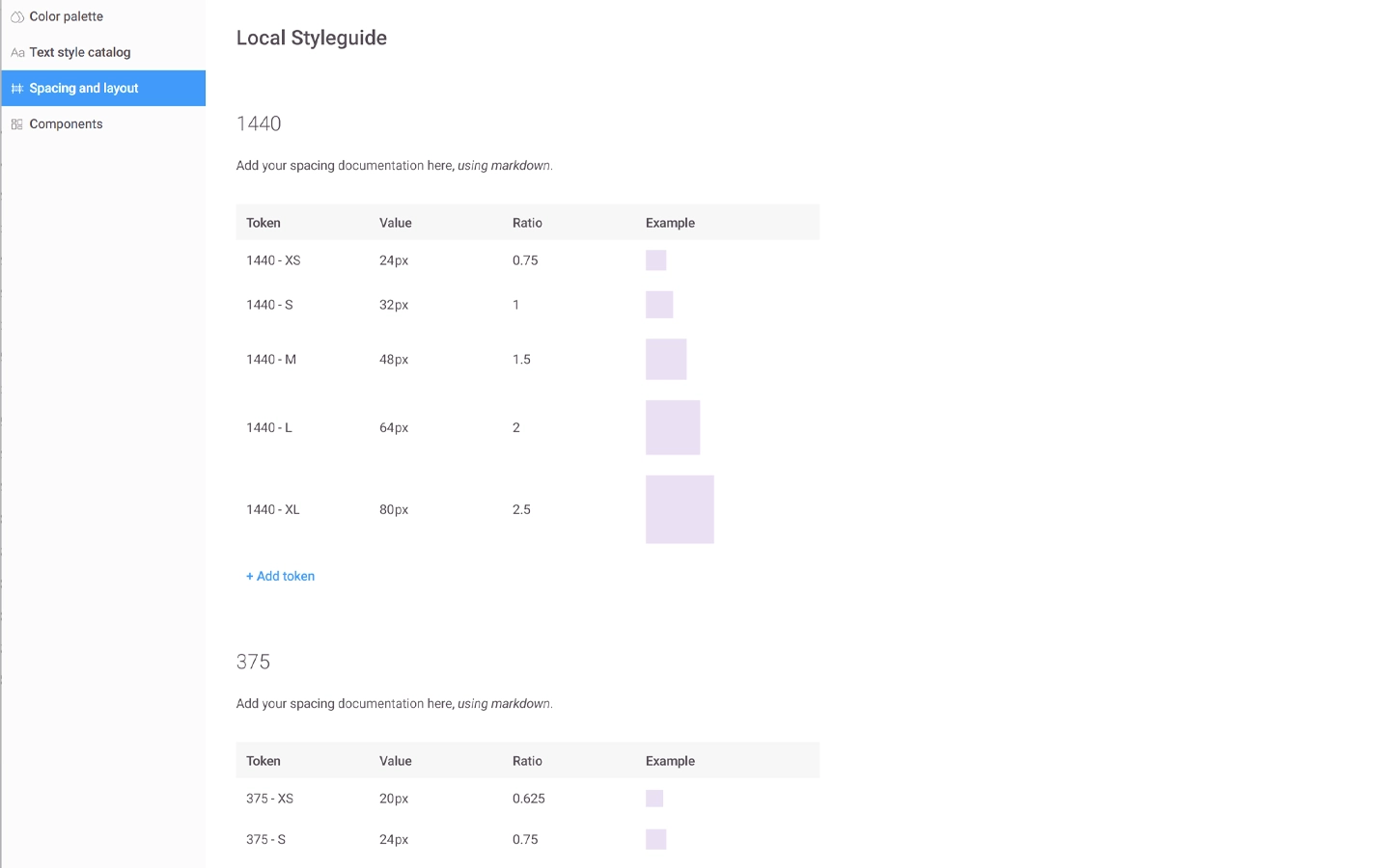
Structured spacing modifiers for different screen resolutions.
Modifiable layout values.
I work on a modifier-based design framework that allows us to simply scale any given layout to the appropriate screen dimensions. I start by building our solutions on top of a typical 12 column grid and clearly specifying horizontal component relations.
Vertical spacing and font sizes, on the other hand, are dependent on rem-based modifiers with well-defined structures and screen width-based breakpoints. We can easily scale our layouts by redefining our variable values at breakpoint-specific intervals. The same logic applies to concentrated alterations to font size values and variable-based color parameters. At times, it may even be more advantageous to leave finer detail polishing to the developed product's quality assurance and testing phases.
Design assets
Repeatable components and visual assets.
Approaching my layout design in a modular and atomic model, I always think of our interface features as a set of repeatable components. It is my responsibility to clearly define component specific values and relations to other content options with their state-specific instance.
Breaking down our design into these essential building blocks gives our developers clear instructions and a set of interface rules to work with. In my design, there is no speculation as to why any of the parts fit together the way they do. This component-based approach, together with properly specified visual asset archives and other variable specifications, prepares my design documents for the actual handoff documentation itself.
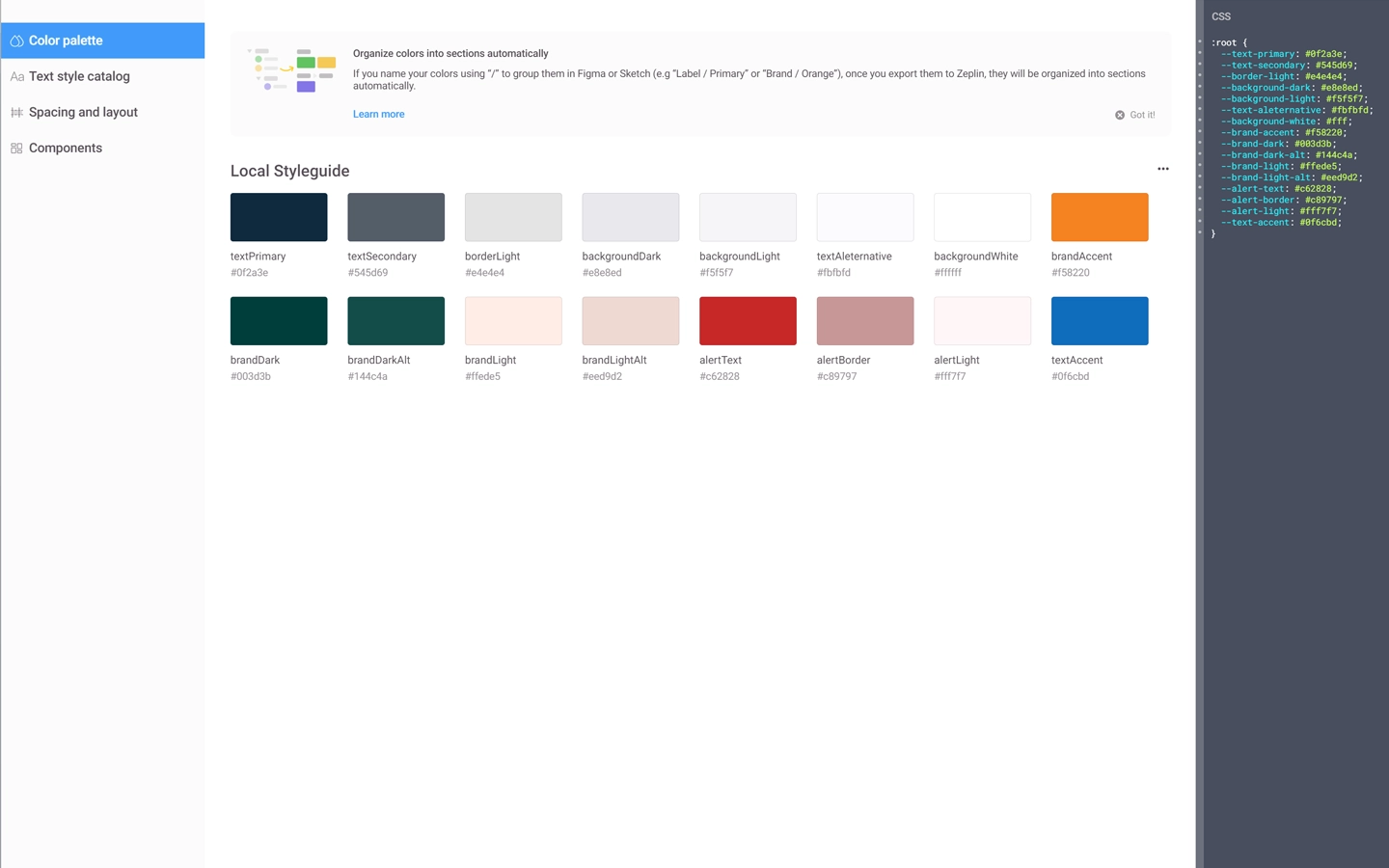
Design asset and variable specifications in developer friendly and standardized form.
Design handoff and documentation.
Passing my design documents on to the actual development will be done on the agreed-upon handoff platform. All conceivable component and content variations, as well as screen-specific layout and interface options, are clearly displayed in a logical order. Starting with the components themselves, I advance through my design files in an ever-expanding manner.
To avoid developer confusion, all building blocks are always provided before they are actually used. Device and screen specific variations are properly organized to allow our developers to easily examine different variations of the same components, and everything is thoroughly commented on, from layout logic to feature and user relations, as well as content-specific administration options. All of this information is then reviewed with our developers, and further conversation is always maintained throughout the development period.
Quality assurance
Making sure that accepted features are implemented as planned.
My responsibility as a designer in digital product development is all but over once the development begins. These integral project phases may be carried out concurrently in an agile manner, or the development phase may begin once all of the layout designs are done. In either case, the final outcomes must be tested and reviewed several times during the development cycle.
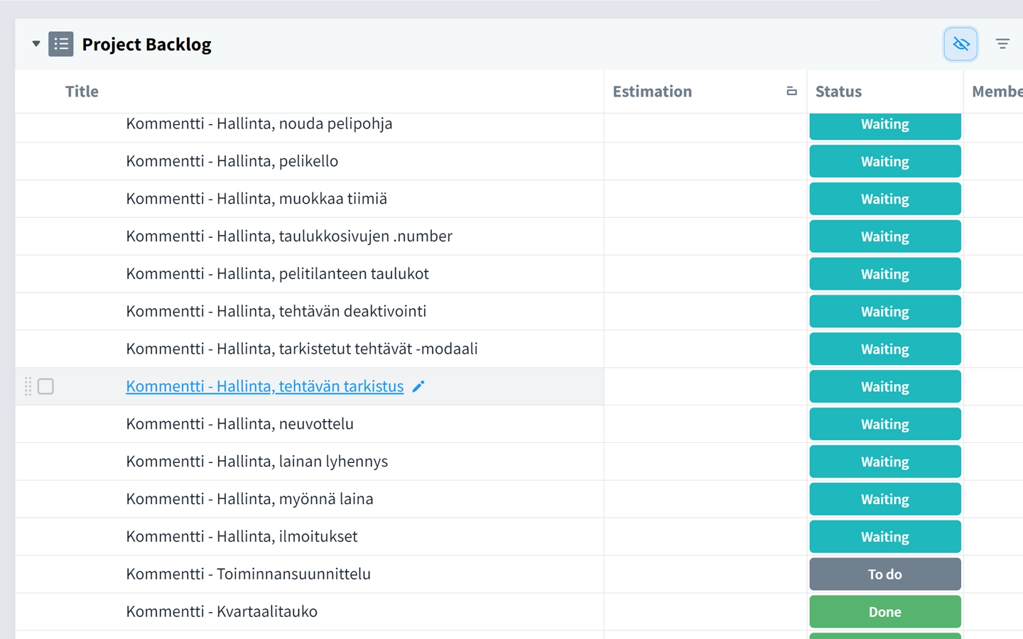
Comprehensive QA review documentation waiting for project team processing.
End product design review.
Having built my layout design approaches on commonly agreed upon principles and approved feature specifications, I am well versed with the services end result requirements. During the QA phase, I review each and every one of the presented product features and screens in a meticulous way.
I comment on the actual feature functions themself, what works and what could use a little more work and how, as well as go through the layouts themselves in a pixel-perfect manner. I document all of my concerns for the project team to break down and try out all possible content variations and screen resolution specific layout instances. As a result, these QA cycles act as an extremely beneficial form of user testing and code review combined with feature validation, and final detail polishing.
Further reading
I play an integral role in your digital product development cycle and go through all of the necessary design stages on each and every project. Take a look at specific steps that particularly interest you, or go in deep and review all of my thoughts regarding the subject.

Making the most of my design expertise.
Having a solid foundation in a variety of concepts and design principles has allowed me to put my skills in good use.




Always open for further discussion.

Call, text, or message me on Whatsapp. I am happy to discuss future proposals with you.
+358 40 584 0104
Do you prefer longer messages? You can always send me an old-fashioned email.
ernesti.niemi@gmail.com